A boutique residential development in the heart of vibrant West Melbourne poised to redefine green living.

ARLO was originally conceived as PDG’s newest boutique residential development, but has since evolved into a build-to-rent project. I’m excited to share the brand identity that was established prior to this shift.

ARLO was originally conceived as PDG’s newest boutique residential development, but has since evolved into a build-to-rent project. I’m excited to share the brand identity that was established prior to this shift.

ARLO was originally conceived as PDG’s newest boutique residential development, but has since evolved into a build-to-rent project. I’m excited to share the brand identity that was established prior to this shift.

CLIENT

PDG Corporation

PDG

SERVICES

Brand Identity

Brand Guidelines

Marketing Assets

Signage

Brand Identity

Brand Guidelines

Marketing Assets

Signage

INDUSTRY

Beauty & Wellness

Retail

Property

TEAM

Heather-Rain O'Neill

Sheli Kuperman

Heather-Rain O'Neill

Sheli Kuperman

THE PROBLEM

THE PROBLEM

THE PROBLEM

ARLO was conceived as PDG’s newest boutique residential development - the brand needed to feel bold and design-forward, while still being accessible to a wide range of potential residents. One of the core challenges was developing an identity that would resonate primarily with young families and current homeowners in the area, without alienating other key audiences such as downsizers and lifestyle-focused renters. The identity had to strike a balance between contemporary confidence and a sense of warmth, familiarity, and long-term liveability.

THE SOLUTION

THE SOLUTION

THE SOLUTION

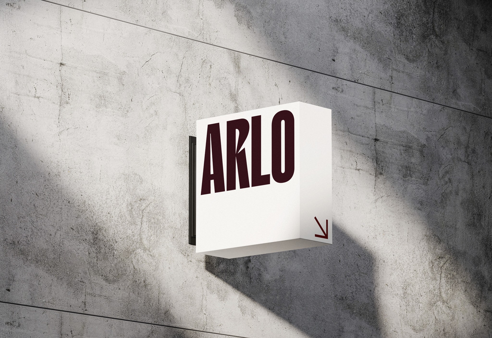
I was engaged to lead the core identity through to marketing collateral, signage, and the display suite experience. The goal was to shape a visual language that felt fresh, progressive, and grounded in real urban living.

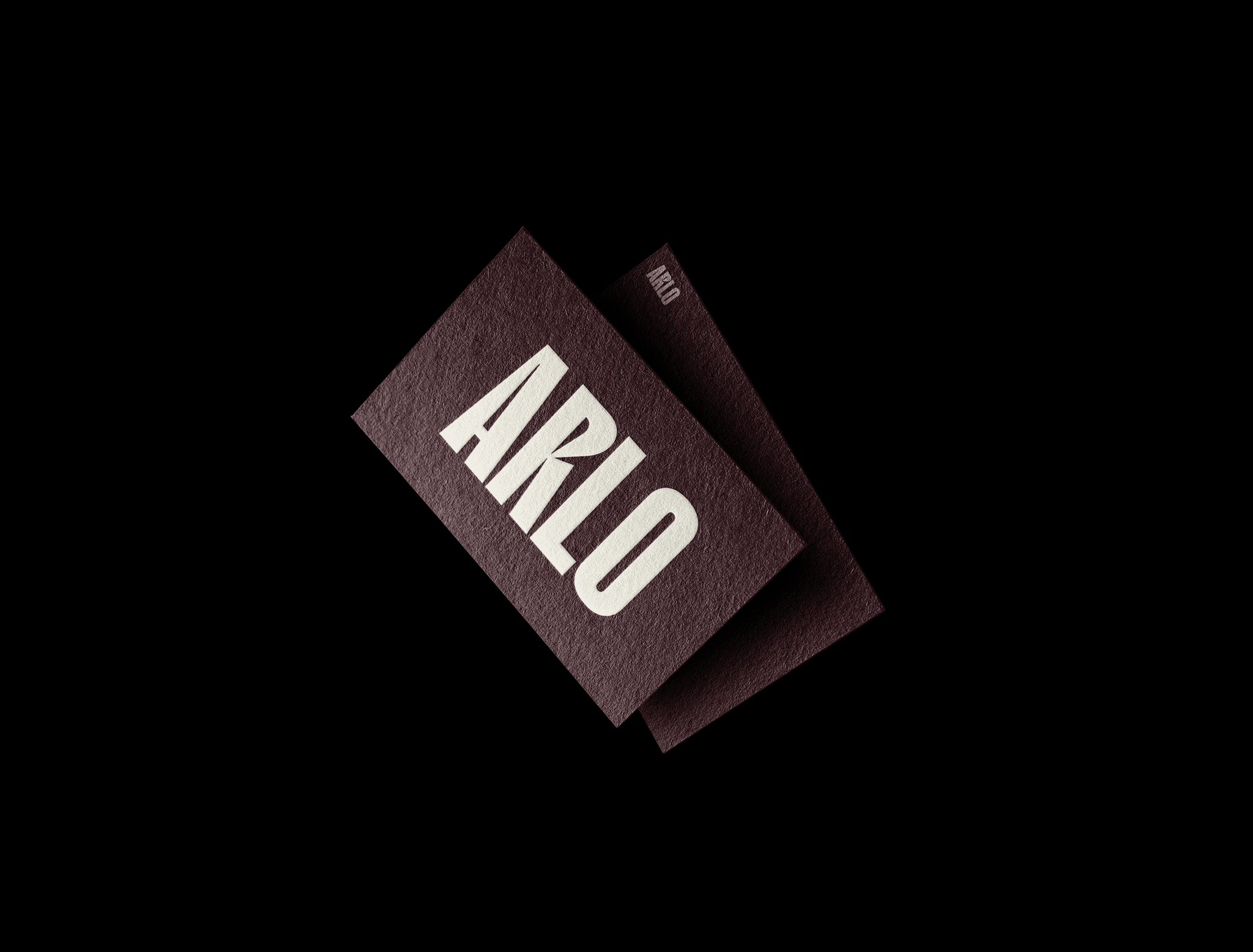
At the centre of the brand is a bold, geometric wordmark paired with a confident sans serif typeface - reflecting the project’s architectural clarity and design-forward character. The identity leverages strong visual hierarchy, minimal layouts, and a refined colour palette to create a sense of precision, while still feeling grounded and relatable. Supporting design elements and messaging were built around lifestyle, locality, and liveability — helping ARLO stand out in a competitive market while connecting with a diverse audience of future residents.

Curious about what we can create together?
Let’s bring something extraordinary to life!

Available For Work

emilybarringtondesign@gmail.com

@emily.barrington


©2025 Emily Barrington

Curious about what we can create together? Let’s bring something extraordinary to life!

Available For Work

©2025 Emily Barrington

@emily.barrington

Curious about what we can create together? Let’s bring something extraordinary to life!

Available For Work

emilybarringtondesign@gmail.com

@emily.barrington


©2025 Emily Barrington